Direction A
Riverline
The four of you stand across the top of the page under one sentence. Then everything you offer sits along a river that runs through the stages of a life.
 Website design directions · October 2026
Before we rebuild your website, we wanted to show you how far the look and feel could go. Each direction below is a working page made from your own words, logo, colours and photographs, so you can open it and click through it like a real site.
How to use this page
Three directions for your new website, each built from your own words, your logo and your own photographs. They are working pages you can open, scroll and try on a phone, not pictures of pages.
Look through each one and tell us which feels most like Hamley House. They are starting points, and parts of each can be combined: the opening of one with the team page of another.
Nothing here changes your current website.
The first screen of each direction on a laptop. Each one opens as a real page you can scroll and click. The label in its bottom-left corner brings you back here.
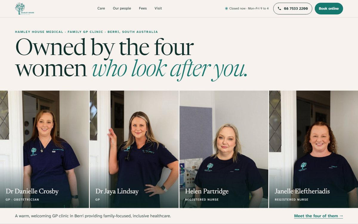
Direction A
The four of you stand across the top of the page under one sentence. Then everything you offer sits along a river that runs through the stages of a life.
Direction B
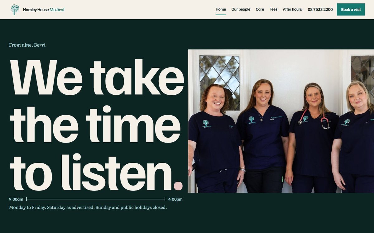
The page is the length of your clinic day. It opens at nine with your own words, "We take the time to listen.", very large, and closes at four with what to do when you are closed.
Direction C
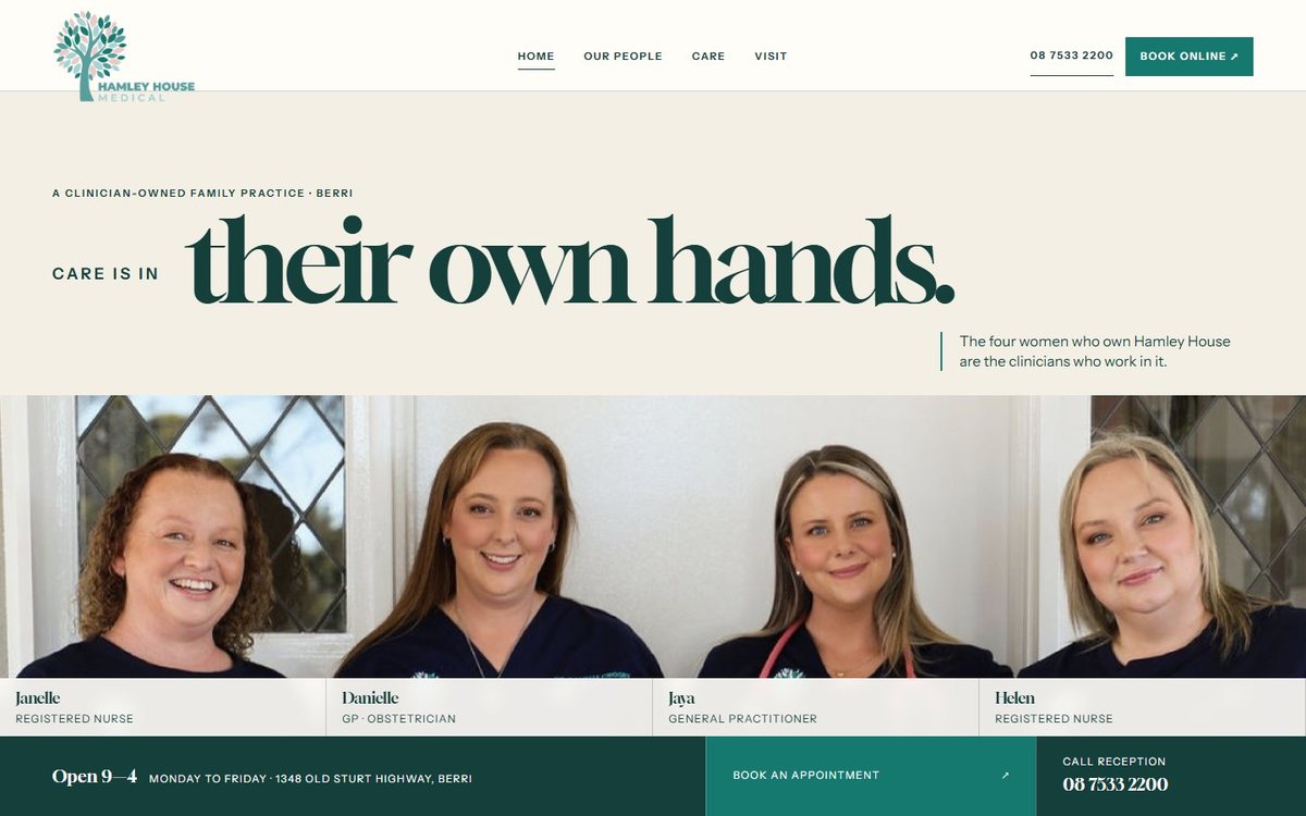
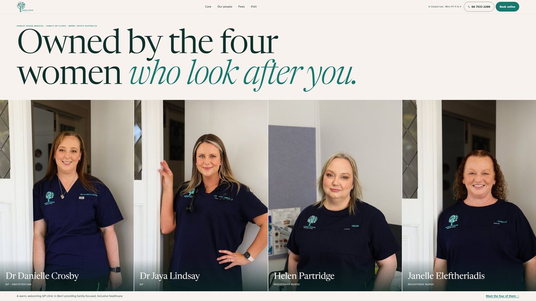
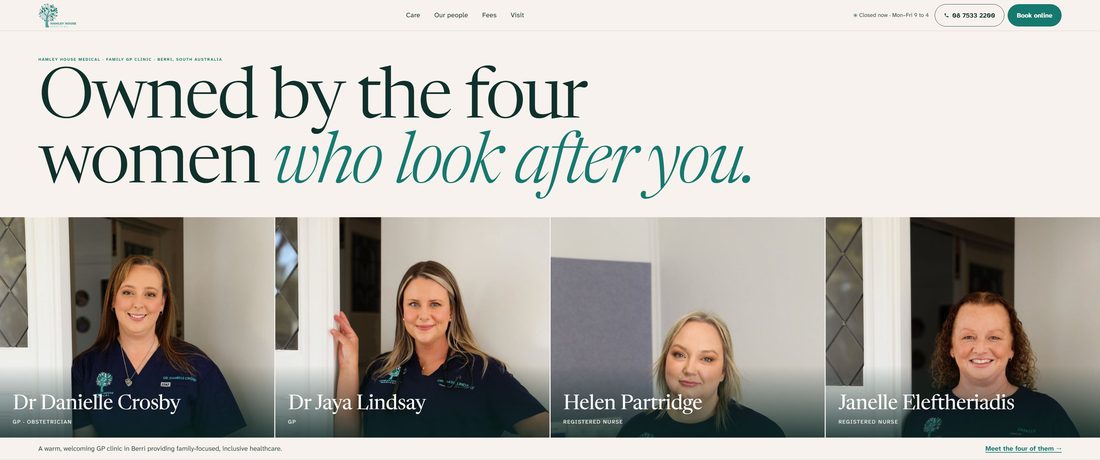
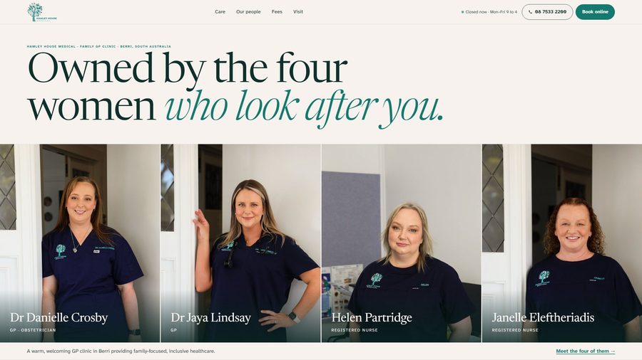
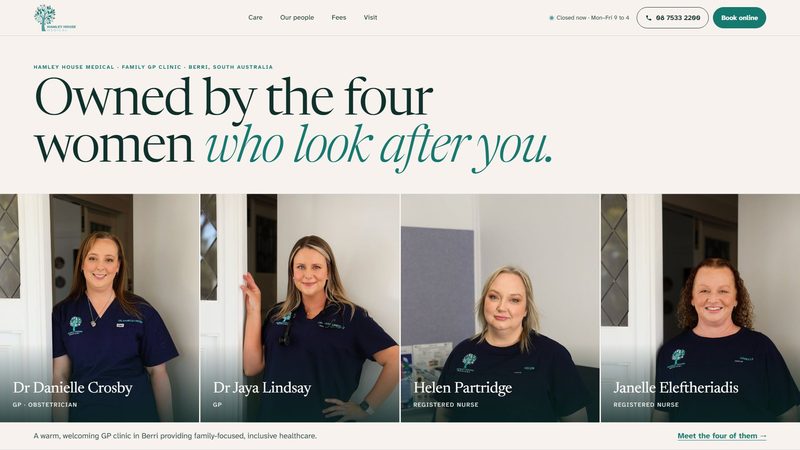
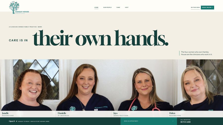
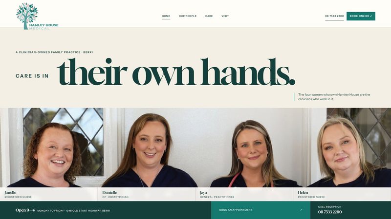
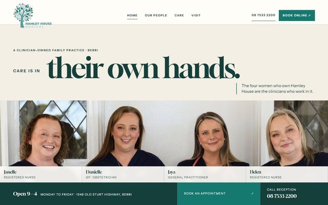
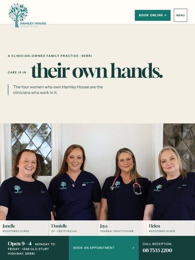
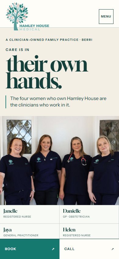
A large, elegant headline across the page, the photograph of the four of you beneath it with each of you named, and your hours and both ways to reach you along the bottom.
A
Direction A
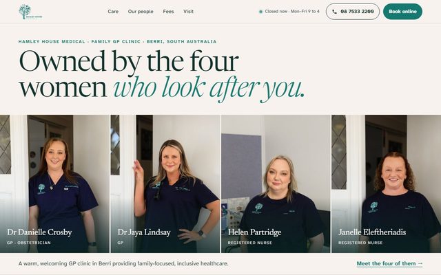
Hamley House is four clinicians, and the page opens by saying so: "Owned by the four women who look after you", over the four of you, named. Your services are then placed along a river, for a practice on the Murray, with six stops from Expecting to Living well, longer, so a patient finds what they need by finding where they are in life.




Newsreader, a warm, light serif, for headlines. Atkinson Hyperlegible for everything you read, a typeface designed to be easy to read for people with low vision, because your patients run from newborns to the very old.
Your own photographs only. The four portraits stand side by side, and each stage of life has the one photograph that is genuinely of it: the ultrasound, the newborn, the children's room, the skin check.
The four portraits rise into view one after another. The river draws itself as you scroll. The top of the page shows whether the clinic is open right now.
B
Direction B
A bold, poster-like page. Your own sentence fills the first screen on deep green beside the photograph of the four of you, with your day drawn from 9:00am to 4:00pm underneath. It ends with "Until four." and the after-hours numbers, 000, Riverland General Hospital and Health Direct, as large as the headline.




Familjen Grotesk, a strong, plain lettering, for the large statements. Literata, a reading serif, for your biographies and everything longer.
The photograph of the four of you sits beside the opening line. Your services are three photographed groups: with a child, for women, and staying well.
The large lettering fits itself to the width of each screen. Sections ease into view.
C
Direction C
Ownership you can see. A large headline leads into the full photograph of the four of you, with your names and roles beneath, then your information in clean, ruled sections: care in three photographed chapters, your fees, and your address as the heading of the visit section.




Gloock, a sharp, high-contrast serif, for headlines. Instrument Sans for everything you read.
The full photograph of the four of you opens the page at every size, followed by each of you in an equal portrait. Consultation photographs sit with the care they show.
Gentle, short reveals as you scroll.
The first screen of each direction on eight sizes of screen, from a 4K monitor down to a phone, drawn at the same height here so the shapes can be compared. Scroll each row sideways.
From a laptop to a 4K screen the four portraits fill the opening and the headline grows with the width. On a phone the four of you sit two by two.
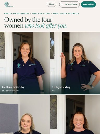
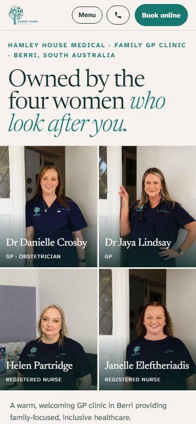
One bold opening at every size, with the photograph beside your words. On a phone it stacks, with Call and Book always at the bottom of the screen.
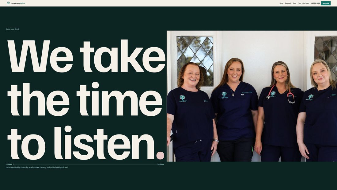
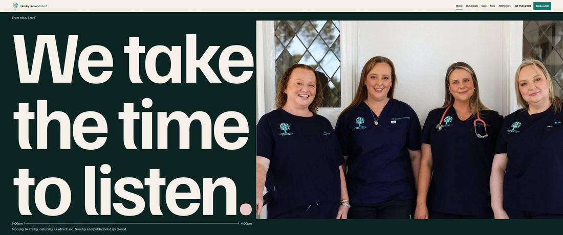
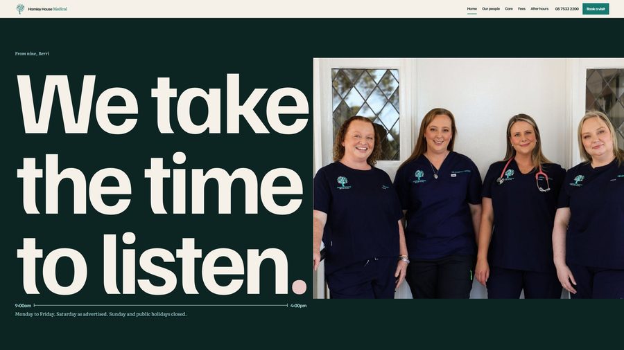
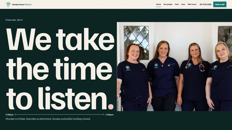
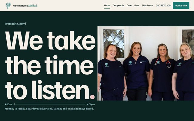
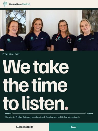
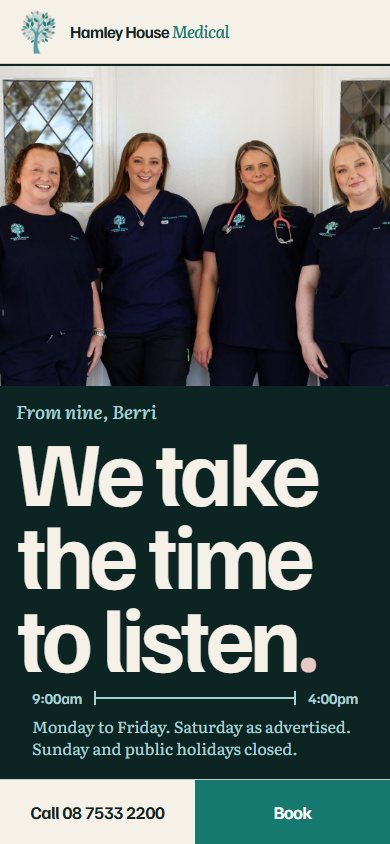
On large screens the opening fills the screen exactly, so the headline, the four of you and both ways to reach you are always together. On a phone the four names sit two by two under the photograph.
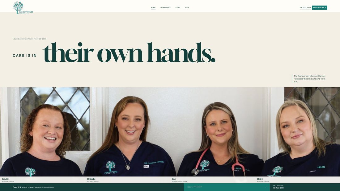
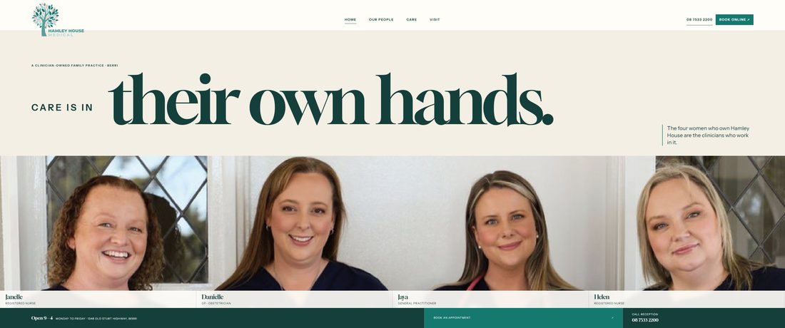
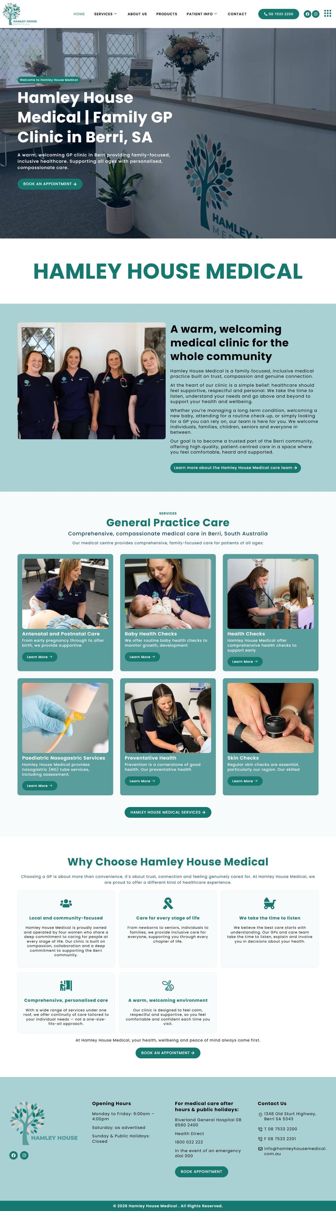
For comparison, this is your website today.
Everything important stays true in all three directions: the same services, your words, your fees and hours, and the two ways to reach you, online booking and the telephone. A few things are left out on purpose: the contact form, the email address and the fax number, because patients put medical details into them, which accreditation asks practices to avoid; and pages left over from the website template the old site was built on.

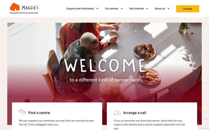
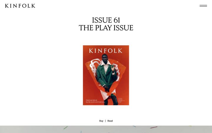
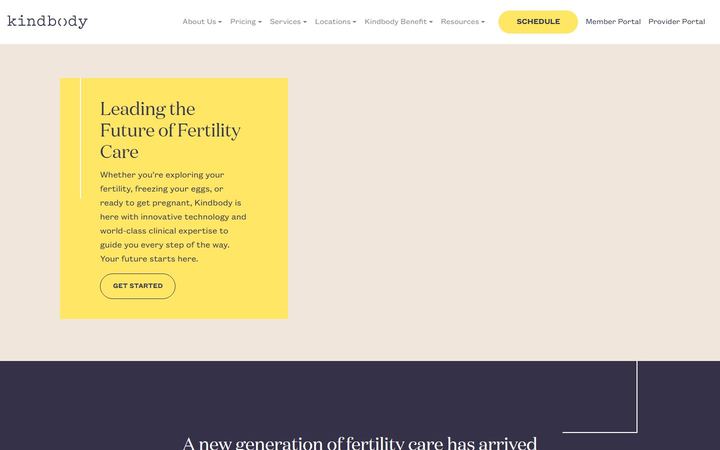
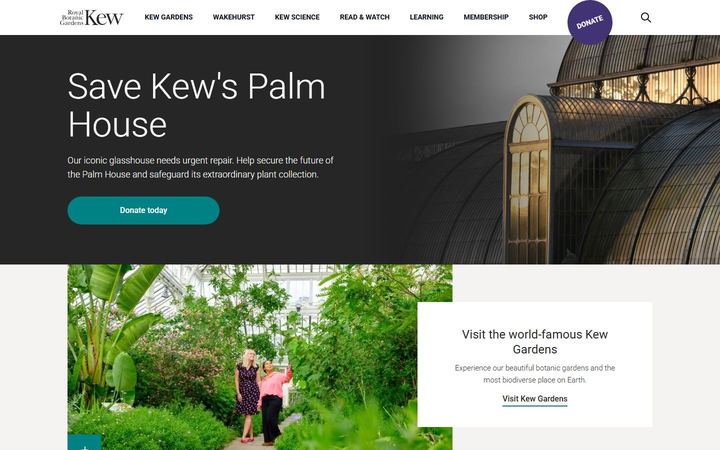
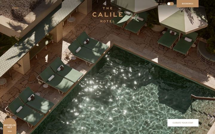
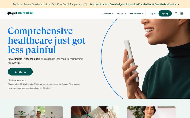
Twelve pages from eleven websites we studied before drawing anything, and what each does well. None is a general practice, on purpose: the aim was to borrow confidence, not a look.
Have a look through each one, on a phone as well as a computer, and tell us which feels most like Hamley House. You are welcome to pick parts of each.
We will then build your choice across every page on a separate preview address, and you will check every fact and every profile before it replaces your current website.
Nothing changes on your current website until you say so.